Pyramid Atlantic Art Center

Overview

Redefining navigation and content organization for Pyramid Atlantic Art Center workshop list, description, and cart experience for desktop and mobile.

Team

Aubrey Min - UX / UI Designer
Jacqui Kim - UX / UI Designer
Selene LaMarca - UX Researcher / UI Designer

Duration

Three weeks.

Tools

Figma
We partnered with Pyramid Atlantic Art Center to help research, evaluate, and redesign their navigation experience for workshops listing, workshop descriptions, and checking out experience for their website on desktop and mobile.

Pyramid Atlantic Art Center is a nonprofit contemporary art center fostering the creative disciplines of papermaking, printmaking, and book arts within a collaborative community. Recently, Pyramid had a website redesign from their text heavy, multiple links, and limited graphics to a more engaging site offering less text, more images and easier navigation. With the new updates some areas of the website did not received updates such as the workshop listing and descriptions, along with the checking out experience.

As a class project, I lead the team consisting of Jacqui Kim, Aubrey Min, and myself (Selene), in partnering with Pyramid to conduct a UX Research and UI designing for workshop list, description, and cart experience the in three weeks.

User Center Design Approach

Who is the Target Audience?

We began with understanding who Pyramid Atlantic is and who are their users. Pyramid’s workshops are geared to anyone who wants to learn, from beginners to seasoned artists. Its audience is more adult-oriented as they did not want to compete with other nonprofits in the area that are teaching classes for k-12. Regulars at Pyramid know the lingo, instructors, and what to expect, but new people are not as comfortable. Pyramid’s biggest goal for the workshop and cart page updates was to help make new customers feel comfortable with the website interface and it connected with the design style of the main website. For our team and Pyramid staff, this was the group of users we wanted to focus our UX/UI design skills on.

1

Stakeholder Interview

with Jen Sheckels, education manager and website coordinator for PAAC.
5

Usability Tests

with new users age range of 23-38, signing up and registering for a class.

Research

Our team used a User-Center Design Process. We began with User Research, creating a proto persona, and conducting user interviews and testing. We engaged with five people who are new to Pyramid and gave them the scenario of signing up and registering for a class. We observed different roadblocks from the five users. Some users could not find the navigation to the workshop list in the navigation bar, others thought the three workshops listed on the home page were the only ones offered, some felt intimidated by the images representing the workshops. These user insights helped us understand common barriers to users as they interact with Pyramid’s website.

Competitor Analysis

We conducted a Competitor Analysis with two Direct Competitors and two indirect competitors. The important data we found from the competitor analysis was the benefit of having a login/sign-up page. Users were able to keep track of the different courses they took and had their information saved for an easy checkout experience.

Heuristic Evaluation

We conducted heuristic evaluations on the workshop list, workshop description, and cart experience to see where there were usability issues. We found several inconsistencies of fonts used, navigation colliding into content when viewed on mobile, etc.

Navigation bar different then the main site.
1
No text hierarchy with title, format, date, and time.
2
No sign up for current members.
3
The link to the instructor website does not link to their website.
4
So much text!
5

Problem Statement

People feel overwhelmed with how information is presented about workshops on Pyramid Atlantic Art Center website. It is hard to find and easily access workshops through the main navigation. Each workshop’s information is hard to digest because there is so much text-heavy content. In addition, the visual engagements are small and not enticing to the organization of the page.

How might we present the content in an accessible and approachable way that makes users want to continue to take workshops at PAAC?

The Approach

With a week and half left of our project deadline, we agreed to split up roles for redesigning. Jacqui Kim focused on redesigning the main workshop listing page, Aubrey Min worked on the checking out experience, and I focused on the workshop description page for desktop and mobile.  To keep consistency of the website, we followed Pyramid Atlantic main website use of typeface, color, white space, and image use.
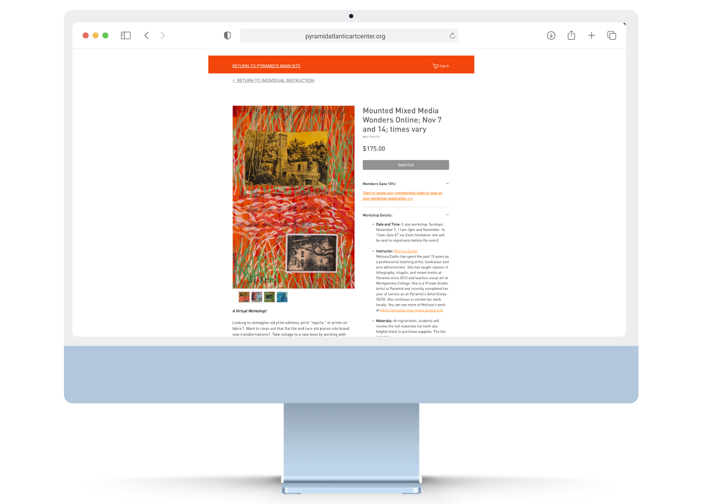
In the user testing of the original site, I observed how after scrolling past the top of the page, users had a difficult time finding the purchasing workshop button.

To help the user be able to purchase a workshop at any time, I created a fixed checkout card attached to the navigation bar. Inside the checkout card, I used type hierarchy to organize the important information of the workshop.
1
User were drawn to the images for the workshop. They would click on the image to seethe image expand, but would cover all of the page’s information.

To adjust for this, a full view width slide show was added to the top of the page for the user to see large images, and page information.
2
User were unsure of the experience level needed for the workshop, and instruction format.

The infographic banner helps the user quickly identity the skill level, key words of the workshop, and what format the workshop will be taught.
3
The materials list becomes a fly out window to help reduce scrolling and amount of text.
4
One common response in the user testing, was the user felt intimidated by the artwork shown in the slide show.

To help the user feel more at easy, a students’ work section was added to show what skill level of previous workshop attendees created.
5
User felt confused of who was their instructor.

To help put a face to the name, an About the Instructor card was added to show an image of the instructor, short bio, and link to their website.
6
Added previous workshop attendees’ quotes about the instructor and workshop are added to connect the user about the workshop.
7
Recommended Workshop options are added to the bottom to help the user find similar workshops at Pyramid Atlantic.
8
Comparison of mobile original workshop description page (left) and full redesign page on (right).
Comparison of original workshop listing and cart pages (left) to redesign pages on (right).

Results

I met with Jen to share the result of our team research and prototyping for desktop and mobile. She was impressed with the research we uncovered and added design elements to Pyramid Atlantic’s website.

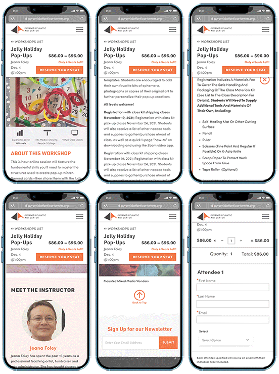
See it for yourself.

Take a look at the linked high fidelity desktop version of the redesign.
View Desktop Prototype

Take a look.

Take a look at the linked high fidelity mobile version of the redesign.
View Mobile Prototype